Converting CMYK to Pantone

When creating graphics to represent your company, you’ll want to ensure that the products you order are in line with your company identity and that all aspects of the product match, especially the colors. To ensure this, having a Pantone color match is paramount. What is the importance of a pantone color match? Most printers use CMYK to process colors for printing and although a standard way for doing so, it can have variance from machine to machine as it is a simple color spectrum that is used to mix these inks. The Pantone Matching System (PMS) on the other hand is more in-line with replicating tones and colors using a standardized guideline. Hence having a Pantone color for your company assets; whether it be from company logo to merchandising, consistency is non-negotiable.
Different Methods To Use
If the Adobe creative suite is unavailable to you for converting, there are a couple other ways to see which Pantone color will best match the color you have. The two other options available are using a Pantone color chart or using a color converter.
Using a Pantone Color Chart
PMS/ Pantone Codes are a standard Color Match system which uses numbers to identify colors. This ensures that colors printed match exactly to what is on screen. For your convenience, we selected the most Popular Pantone Colors For Designs listed by their color number which is located on the top of the color blocks. For our products, we use the Pantone Color Book Coated; you’ll want to reference this specific book if you have a particular color match. If you are unsure of what is the best practice for color matching using a color chart/ book, referencing our article on General Guidelines Critical Color Match is a great first step. There you will be trained on why we use CMYK for printing and how colors differentiate depending on the screen being used and why Pantone color matches are so important in our industry. If you are providing a design by the “Upload Artwork” option, you’ll want to ensure that your files follow the preferred formats listed in the article. Once you have selected a Color Match book, you can flip through the pages to find the exact color that matches. Once you have found a color, you’ll want to inspect the several lines of information that is found with the color.
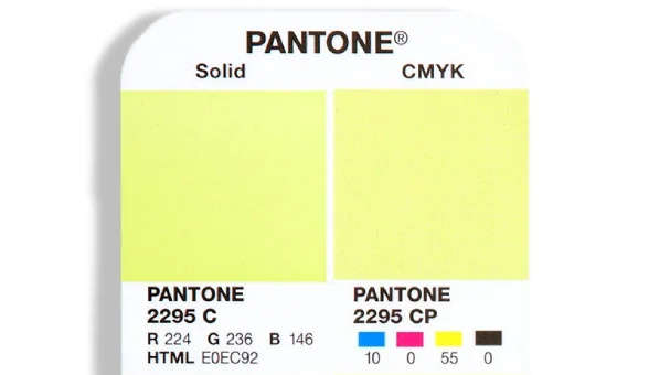
Understanding the information provided with each Pantone color is equally as important. Here is a simple breakdown of the Pantone swatch above.
- The left row of colors is known as the spot colors. These represent what the color will look like when mixed using traditional Pantone inks. Below these color blocks are the RGB and HTML values that correspond with that specific color.
-The right row represents the process color also known as color process color. Process colors are the result of breaking down the color into four sub-colors used in the printing process known as CMYK. Below each color block you will see the individual breakdown of each color in the CMYK process. The basic breakdown of CMYK is cyan, magenta, yellow and black. Varying these amounts will result in different colors. These values are what you will need to convert your Pantone color to CMYK.
Using a CMYK to Pantone Converter
PMS/ Pantone Codes are a standard Color Match system which uses numbers to identify colors. This ensures that colors printed match exactly to what is on screen. For your convenience, we selected the most Popular Pantone Colors For Designs listed by their color number which is located on the top of the color blocks. For our products, we use the Pantone Color Book Coated; you’ll want to reference this specific book if you have a particular color match. If you are unsure of what is the best practice for color matching using a color chart/ book, referencing our article on General Guidelines Critical Color Match is a great first step. There you will be trained on why we use CMYK for printing and how colors differentiate depending on the screen being used and why Pantone color matches are so important in our industry. If you are providing a design by the “Upload Artwork” option, you’ll want to ensure that your files follow the preferred formats listed in the article. Once you have selected a Color Match book, you can flip through the pages to find the exact color that matches. Once you have found a color, you’ll want to inspect the several lines of information that is found with the color.
Using Illustrator to convert to Pantone
Although there are many different avenues for creating designs, in our industry most designs are created with Adobe Illustrator. We will be diving into how to use Adobe Illustrator to convert your project’s CMYK colors to Pantone colors.
1. Have your desired project open and the item you’d like to color match selected.
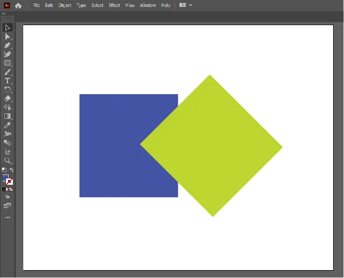
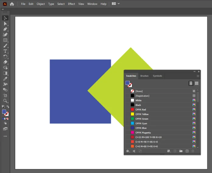
2. Click the “Window” drop down menu located at the top navigation bar.

3. Select the “Swatches” menu. This should open on the main document.
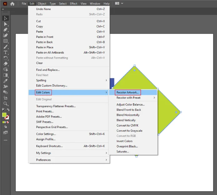
4. Open the “Edit” drop down from the top navigation bar. Then select Edit Colors à “Recolor Artwork”.
5. Ensure the color section is limited to the colors you specify.
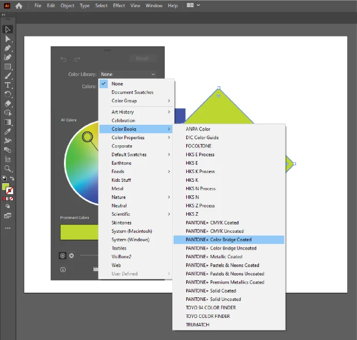
6. Select the appropriate color book for your application. In this instance, we are using Pantone Color Bridge Coated.
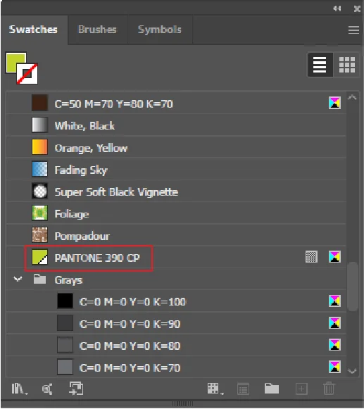
7. After you click “OK”, the pantone swatch for the color you highlighted will appear in the bottom of the swatch menu. When hovered over with your curser, the swatch name will appear.
Lush Banners Is Here To Help
If you ever have any concerns or questions while converting from CMYK to Pantone, design specialists are always one phone call or click away. At lush banner, we offer an online chat to assist customers with any needs they may have. Once an order is placed and the design is created, you will receive a proof which if specified, will have the specific Pantone color match noted for the production team. This will ensure that your product will match your company’s other products which will preserve your brand identity and appearance to consumers. We encourage customers to limit Pantone color matches to 1-2 colors per print. Exceeding these recommendations will result in extended production times and potential color variances with other colors in the print.